
Fitbit on Google Pixel Watch gets Material You makeover ahead of Watch 4
Fitbit’s Wear OS app has started receiving a visual redesign. The new look brings more vibrant colour, better use of gradients and cleaner buttons that sit more naturally within the circular display of the Google Pixel Watch.
Fitbit app on the watch gets a visual refresh
This update is part of Google’s broader move to adopt Material You’s M3E design language (Material 3 for Wear OS, with the “E” referring to Expressive) across its smartwatch platform. The goal is to offer a more expressive, layered interface. On the watch, that means bolder icons, smoother shapes and a visual structure that aligns better with the curved hardware of the Pixel Watch.
Essential reading: Top fitness trackers and health gadgets
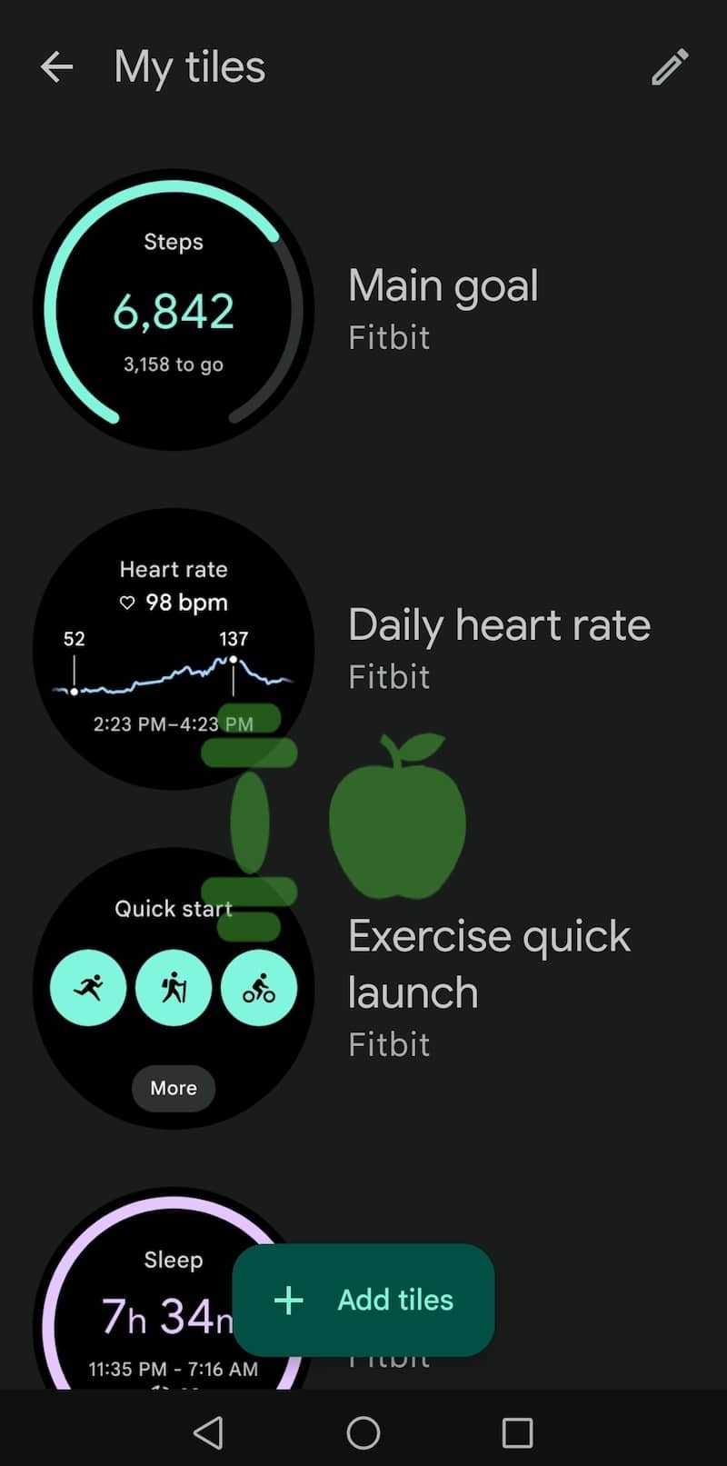
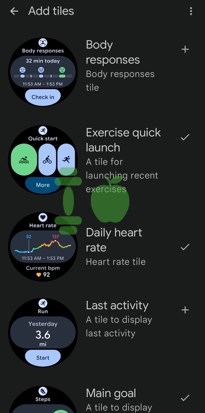
You can already spot the changes in Fitbit tiles like Daily Heart Rate, Main Goal and Exercise Quick Launch. The earlier design used flatter colours and more subdued elements. In contrast, the new version adds depth and contrast, making the content more readable and visually appealing. It also feels more aligned with what Google has been doing on Android phones over the past couple of years.
The contrast between the old and new UI becomes clear when you compare the two as shown in the screenshots below. The updated tiles make better use of colour hierarchy and space. Buttons feel more tactile and fit more naturally into the overall theme of the display. The redesign doesn’t overhaul the structure of the data but simply presents it in a more refined way. The core functionality remains unchanged.
A timed update just before Pixel Watch 4
Timing is likely not a coincidence. With the Pixel Watch 4 expected to be announced next week, Fitbit’s facelift may be part of the platform-wide changes we’re about to see. The update is currently rolling out to some users. It’s not yet universal, but this is likely part of a staged release that will pick up pace over the coming days. I personally can’t see it on my Pixel Watch just yet, but others users have been seeing it.
A note – to avoid confusion. The redesign only applies to the Fitbit app on the watch, not the smartphone Fitbit app. That may come later. Other Wear OS apps are also expected to adopt M3E-based designs soon, though there has been no official timeline. What’s clear is that Google wants a more unified aesthetic across its hardware and software.
This article originally appeared on Gadgets & Wearables, the first media outlet to report the story.
Subscribe to our monthly newsletter! Check out our YouTube channel.